More Than Just Pretty Pictures
Data visualization can help staff members, from certified nurse assistants to executives, comprehend the data they need to do their jobs.
Lee Kilmer
9/1/2016
It is said that a picture is worth a thousand words. Of course it would take many words and phrases to describe a favorite beach scene, or mountain vista. And viewers of such images tend to develop their own conclusions or even create their own stories.
With business data, the situation can be very different. Here imagery is needed to support decision making and provide context to the questions being asked about the data. Visuals should lead the user to valid conclusions and avoid misinterpretation.
This may be more important for long term care providers than it is for any other operation since misinterpretation of facts from faulty visuals can have a profound impact on outcomes for both the resident and the business.
What To Consider
So how does a company ensure its data visualization efforts are hitting the mark? Here are some basic best practices to consider.
1. Consider the user. Not all users want to receive the same information the same way. An executive may need to understand trends associated with quality measures, while a nurse may need to know who is at most risk for a fall in her unit. The chief financial officer may want profitability analysis, while the administrator needs to understand specific expense variances. Think about what questions different users will have of the data, and how visualization and supporting analysis can help them determine appropriate actions.
2. Let the data speak for themselves. Choosing the best way to represent data is key to providing insight and understanding to the user. Leaders may require graphical charts that allow them to quickly judge performance at a glance. Nurses on the floor may require a list of residents having a negative impact on a particular quality measure so that each resident can be assessed and appropriate interventions implemented to improve outcomes—which may not be presented graphically at all.
When considering graphics, it is important to match the right picture with the right situation. Pie charts provide ways of seeing a snapshot of data at a point in time. Adding a stacked bar that is plotted along a time axis may provide a way of seeing relative value points of different data elements, along with trending.
A bubble chart adds an additional dimension (size of the bubbles). Images such as maps provide an intuitive way to view location data and, when overlaid with conditional formatting, can add a more at-a-glance context for the user. Info graphics provide a way to tell a story.
3. Think of the dashboard as a mini application. A dashboard is ultimately a mini application for the user to gain insight into clinical outcomes or operational performance. Designing dashboards to focus on key roles, key performance indicators, and supporting analysis can provide a cockpit for the user that helps them fully understand the issue at hand without requiring them to be an expert on building charts, ad-hoc queries, or underlying data models and thus enables leadership and frontline staff time to focus on what they do best: care delivery.
4. Self-service dashboards can remove information technology from the business of creating dashboards and allow users to answer their own questions or follow their thought processes through the data to support decision making.
5. Be agile. Analytics is never done. Users will always demand more as the business or regulatory environment changes. Expect to work iteratively, and frequently involve users from different levels with a healthy dose of acceptance testing and validation from the intended audience.
Putting it into practice
Say a long term care provider wants to reduce hospital readmissions. There are a number of actors involved, from the executive team and quality improvement directors, to the nurses on the floor who can influence these results, each with their own information needs. If the leadership team can leverage visualizations and data analysis to identify macro trends, further exploration of associations and root cause analysis of these trends can result in the development of specific programs aimed at driving down readmissions. And by providing nurses on the floor with the right information at the right time, they can work with individual patients to reduce the risk factors that lead to readmissions in the first place.
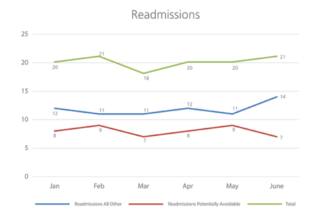
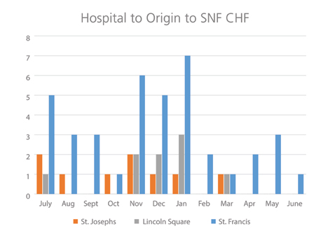
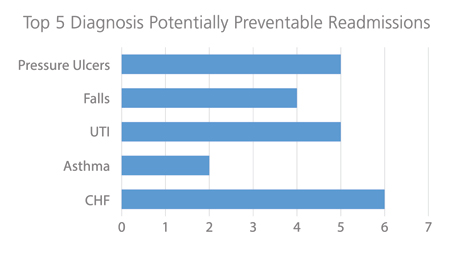
The executive may want to monitor areas of highest risk for readmissions and know things like what are the top five causes of readmission, which causes are considered to have been preventable, which acute care facilities tend to transfer patients who return to the hospital within seven to 10 days, and what doctors are admitting the most patients who are readmitted within 30 days. These findings can lead to improved collaboration among acute care facilities and providers.
Nurses may want to track residents at highest risk for readmission by diagnosis and ensure appropriate care plans and prevention interventions are in place and being monitored to avoid readmissions. Nurses may implement process improvement strategies or staff training for specific diagnoses and monitor the impact on readmissions to evaluate effectiveness.
Executives may need a dashboard that shows the top five diagnoses that cause readmission and allow them to follow their thought processes to analyze the root causes. This could be done via a series of linked graphics and charts that are easily navigated with no training required. This provides actionable information they can use to work with acute-care providers or help improve processes within their own facilities.
Good data visualization is about more than just the pictures being presented. It is about letting the data tell a story that can be tailored for the user and provides insight to the actions necessary to move beyond simply measuring organizational performance to improvements in resident and organizational outcomes.